Walt Disney World (and Disneyland) have rolled out new versions of the My Disney Experience app, greatly improving the map functionality. The new version of the app is 8.6. The new update puts more information in front of guests’ eyes at a glance, rather than hiding it in multiple sub-menus. Here’s a look at what changed and why we’re fans of the update.
My Disney Experience Map Improvements
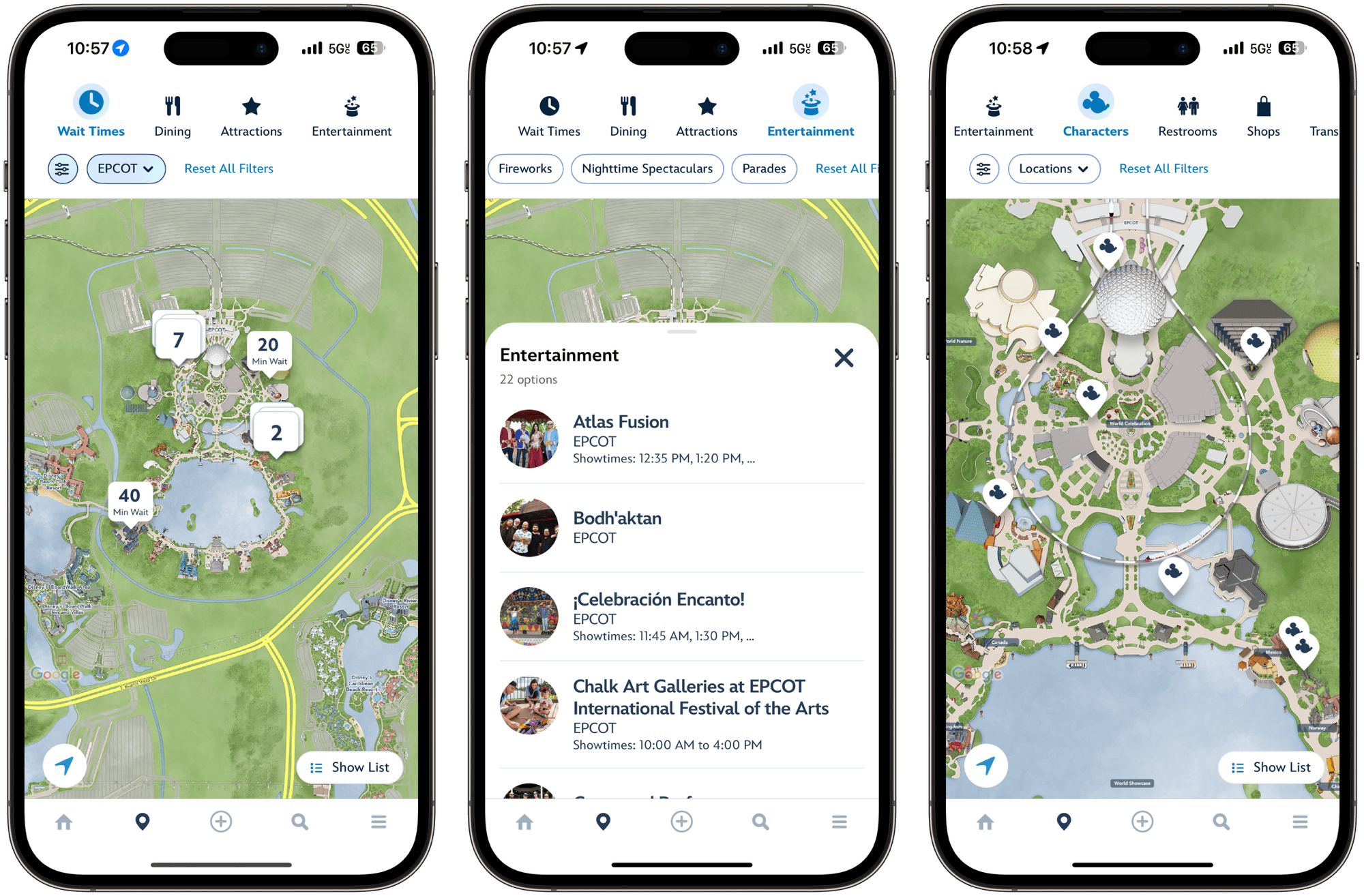
At first glance, the map looks similar with information and filters at the top, and a digital map taking up most of the screen real estate. However, Disney has immensely improved the amount of information presented on the screen.
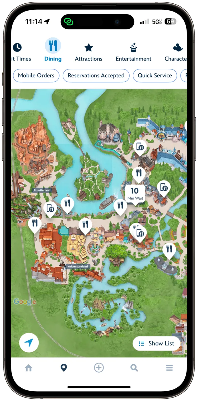
Here’s a look back at what the map page used to look like, compared to the new look that rolled out today. As you can see, the initial filter list such as “Wait Times”, “Dining”, “Attractions”, and more are no longer in a drop-down menu. Instead, they are on a horizontal scroll menu at the very top of the screen. From there, additional filters are available at a glance. More on that after the screenshot of the new information presentation.
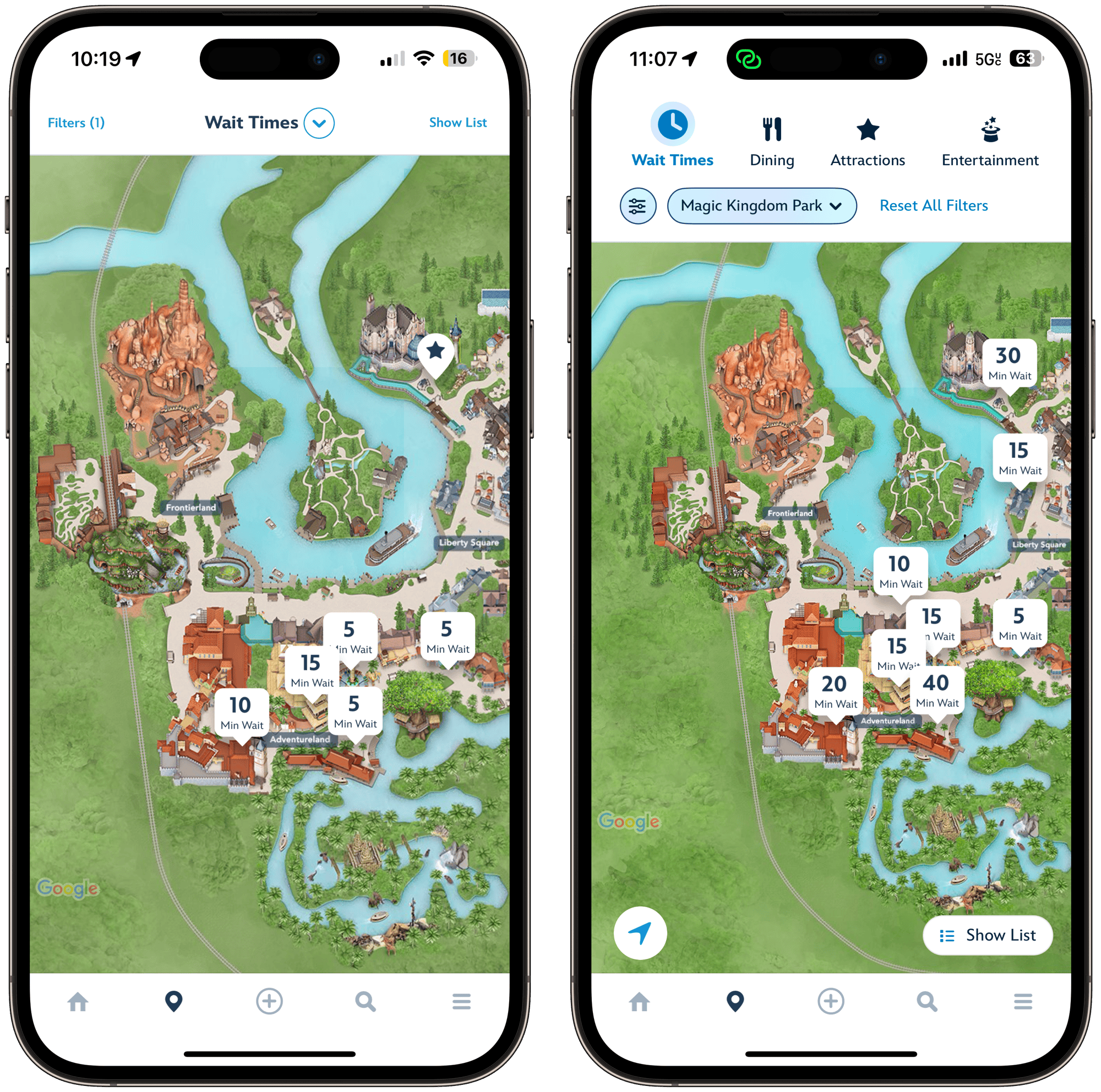
As you can see below, the additional filters are also presented in an easier-to-find fashion. The additional filters were previously “hidden” behind a “Filter” button as seen in the Ariel screenshots below. Now, any relevant additional filters are presented on a second line below the initial top filter line. Just like the top filter line, the additional filters line is a horizontal scroll, ensuring that you can access all of the relevant information without having to jump between screens. But what if there is additional information? Keep reading past the screenshots below to see how the updated map page handles that!
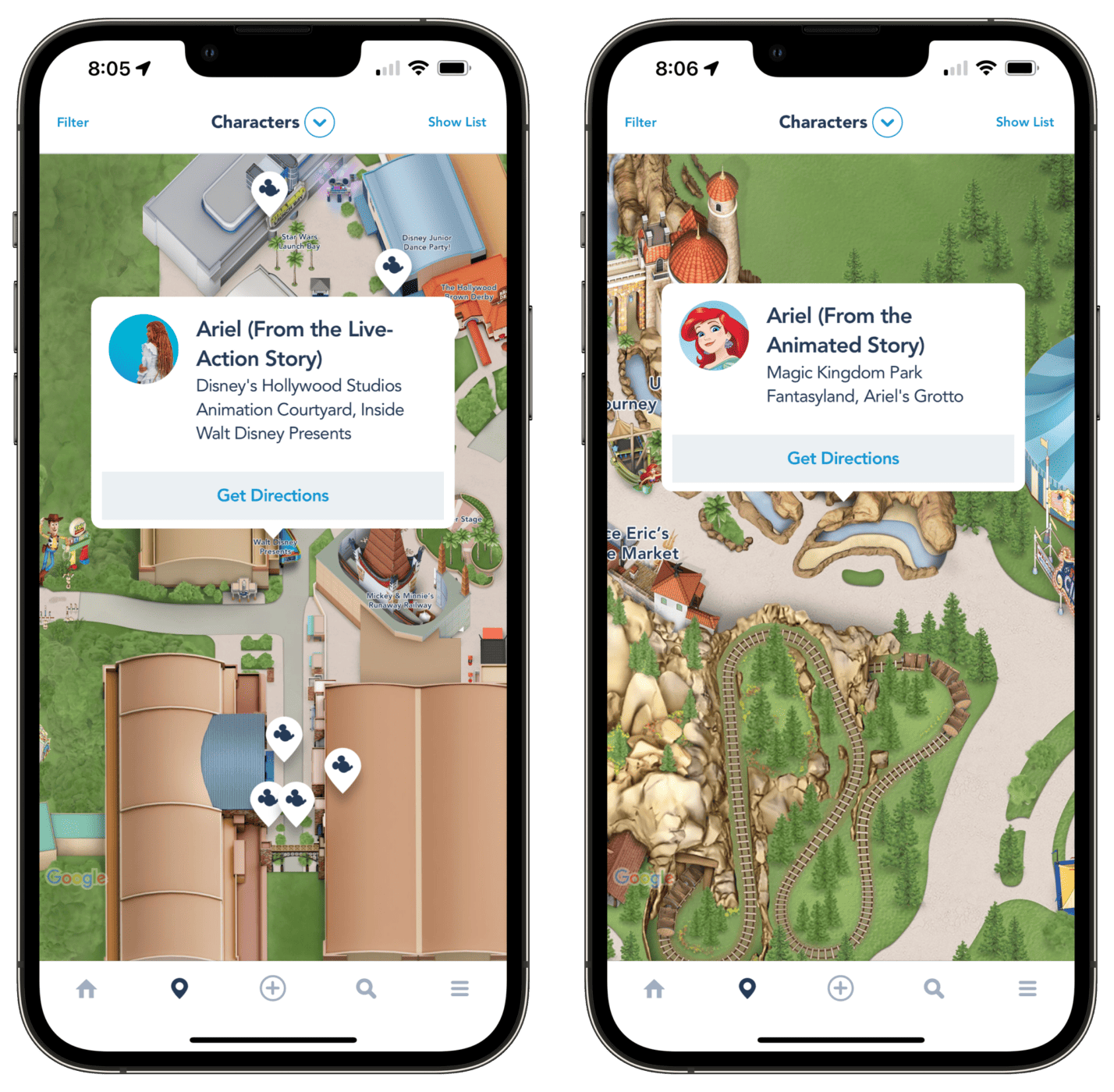
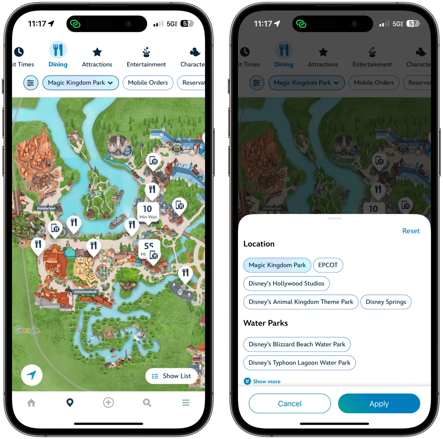
Say that I want to change my filters and the choice is not an “on/off” filter, but instead something with multiple options. In this example, I want to change parks from looking at dining within Magic Kingdom to filter my choices to EPCOT only. I click the “Magic Kingdom Park” drop-down, and a card pops up from the bottom of the screen, showing me my additional filtering options. Check out the screenshot below to see it in action.
Furthermore, if I have too much information and prefer a list view, the list view card pops up from the bottom of the app and then goes full screen if I start scrolling to see more options. I can then hit the “X” to return to the map view.
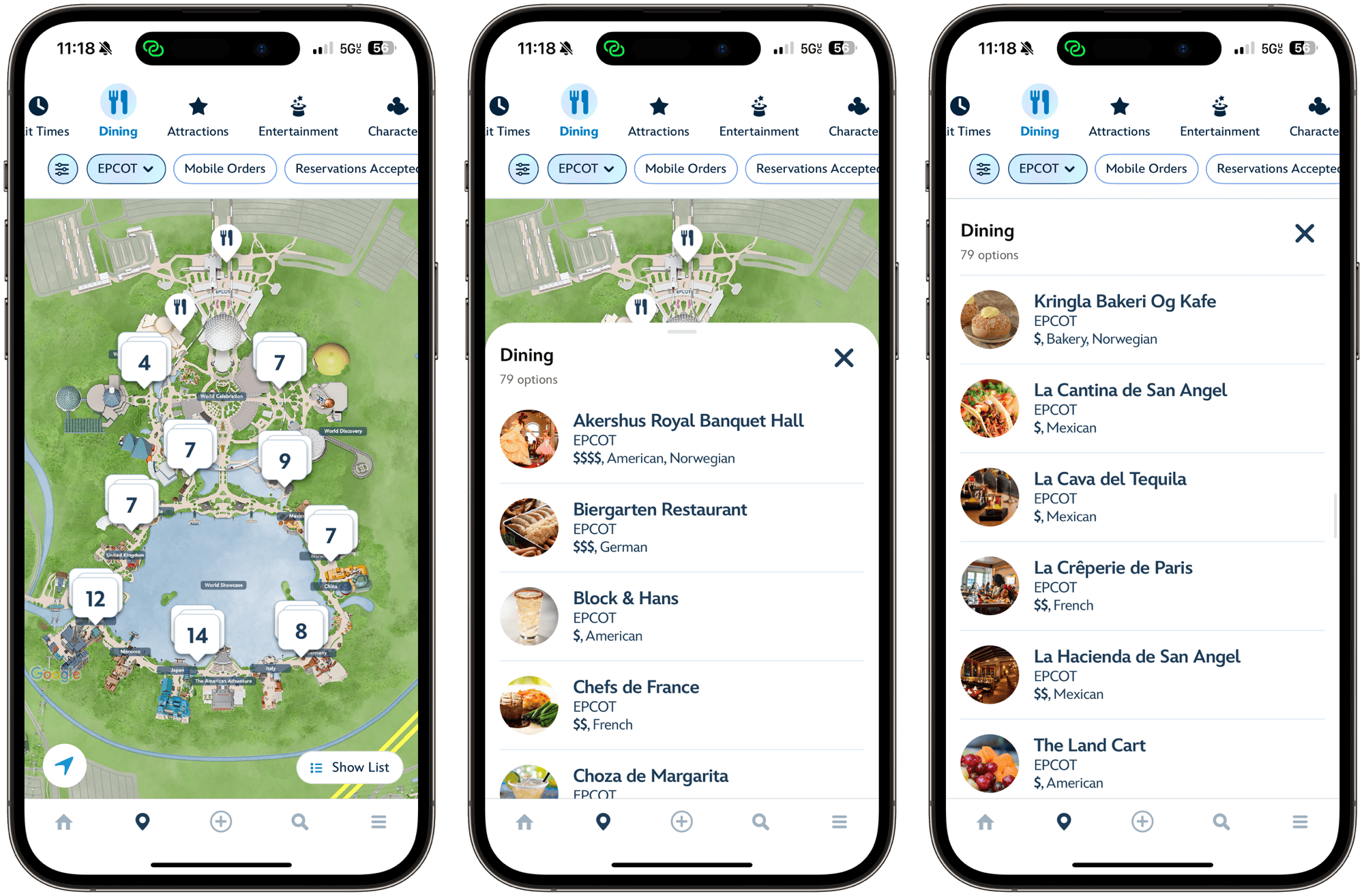
This is a wonderful update for the functionality of the map page within the My Disney Experience app, surfacing more at-a-glance info than ever before and making finding what you want much simpler.
As always, keep checking back with us here at BlogMickey.com as we continue to bring you the latest news, photos, and info from around the Disney Parks!


